Category: Power BI

What happens when a User has Multiple RLS Roles in Power BI?

Row-level security (RLS) in Power BI allows restricting what data users can see via boolean DAX expressions; this is done per dataset.  I never thought much about what it meant for a user to be assigned multiple roles until it came up in a meeting, in which I quickly declared “it would be the AND union of the conditions of each of the roles.”  One of the attendees, just as swiftly, responded that he thought it would be the most flexible combination, meaning an OR union of the conditions.  So which one is it?

To my surprise, I couldn’t find an article online that explained which one it was.

Let’s quickly review RLS.  The process to define RLS for a dataset is more or less as follows (for a full tutorial see https://docs.microsoft.com/en-us/power-bi/service-admin-rls):

  1. A role is created in Power BI Desktop and defined by declaring one or more boolean DAX expressions against the dataset.  For example, Customers[Gender] = “M”.  This would restrict members of that role to see only male customers.   Moreover, that same role could have another expression associated with it, such as Geography[Country] = “Canada”.  The conditions are AND-ed and members of the role would be able to see only male Canadian customers.
  2. Additional roles are created in the same fashion, as necessary.
  3. The report is published to the Power BI Service.
  4. A user with permissions to the workspace accesses the dataset’s security page and assigns each intended user to one or more roles.

So what happens when a user is assigned to two roles?  Is the data filtered for the user by OR-ing the expressions of each role or by AND-ing the expressions of each role?  That is, is it

Role1Condition1 AND Role1Condition2 AND … )
OR ( Role2Condition1 AND Role2Condition2 AND … )

or is it

Role1Condition1 AND Role1Condition2 AND … )
AND ( Role2Condition1 AND Role2Condition2 AND … )

The answer is the first expression, the least restrictive.  See the attached Power BI report (Multiple Roles) if you want to experiment yourself with roles and sample data.

For real-world context, this came up when discussing how to secure a workspace and a dataset in light of 150 users and two roles: one with full access to the data and another with partial access to the data.  The 150 would split at about 5 for the first role and 145 for the second.  We needed to give access to the app to all 150 and then assign users to roles.  We were wondering how many AD security groups we needed to create and manage.

If the conditions for the roles were AND-ed as I initially thought, we were going to need one group for the 150 to access the app and another group for the 145 in the more restrictive role.  The 5 users for the “full” role would be entered individually.

However, if the conditions for the roles were OR-ed, as is the case, we would only need one group for the 150.  The partial role would have all 150 users and the 5 users for the “full” role would be entered individually.  The OR logic would automatically give full access to the 5.

P.S.  How do you define a role with full data access?  Just create the role but don’t add any DAX expressions for it.

Download the sample report here: Multiple Roles.

Please follow and like us:

Power BI: Resolving one case of “Access to the Resource is Forbidden”

Just last week while returning to work on a Power BI report I get this message when trying to refresh the data:

What the heck?  In Data Source Settings everything looked fine.  My report used a couple of OneDrive connections that looked OK, for example:

After a while of double-checking folder locations, file names, permissions, etc., I thought I would just try removing and reentering the credentials in the dialog above and voilà, problem solved.

Please follow and like us:

Power BI Best Practice: Use Parameters for Connection Information

This best practice is a simple corollary from a software engineering principle: never hard code values in code!  I am singling out connection information as in Power BI all work begins by connecting to one or more data sources.  You should always use parameters to refer to server addresses, database names, folder paths, and file names, for example.  For a tutorial on parameters see this article from Microsoft: http://tinyurl.com/hwftfda.

There are several benefits to this:

  • More readable code.  It’s easier to understand this M code:

    Source = Sql.Database ( #”QA Server”, #”CRM Database” )

    than this M code:

    Source = Sql.Database ( “333.444.55.66”, “DB459” )

  • Changes are easier to make.  If you have several queries against a database, for example, and the server address or the database name changes, then you only need to change parameter values, not each query’s code.  Consider a scenario in which you begin report development against data sources in a test environment.  When the time comes to test against the production environment it is more convenient to make the switch by editing parameter values.
  • Dependencies are explicit.  By just looking at parameter names and values you can tell what a report’s data source dependencies are.
  • Parameters can be changed in the Power BI service.  If connection information changes after publishing a report, parameters may be edited online in the dataset’s settings.  No need to republish the report.  Following a previous example, consider a situation in which you don’t have access to production data sources.  You may publish the report with the test environment’s parameter values and then edit the connection information after publication.  (For this to work the Power BI data gateway needs to have the production environment’s data sources defined.)

Please follow and like us:

Using Z-Order to “Hide” Visuals Targeted for Phone Layout in Power BI

One important but often overlooked design requirement for a report page
is whether it will be viewed in phones and not only in desktop devices. And even
when we are aware of such a requirement it might be a challenge to use visuals
that work well for both kinds of devices. This is because in Power BI the desktop
layout is the principal layout: the phone layout simply allows you to choose from the visuals already present and configured in the desktop layout. But sometimes we need visuals targeted for phone layout only.

Such a need may arise with “wide” visuals, such as a column chart with many categories in its X axis, a situation which I faced in a recent report that led me to write about this. The visual in question displays amounts by day number:

On a phone this visual will require heavy scrolling, which is quite inconvenient, as evidenced when viewed in phone layout:

A bar chart would be more suitable for a phone as there is “infinite” vertical space available.  In this image I chose to cap it at 24 days but could have gone the full 30:

So what to do?

Without layout independence one might think that an easy solution would be that a visual designed and configured specially for phone view might just be hidden (via the Selection Pane) in desktop layout and then selected in phone layout. However, while the visual may appear to be available when you switch to phone layout:

when you drag it onto the phone canvas it “disappears.”  This is what I see after dragging it to the top of the canvas:

My solution to this was to use the z-order setting for visuals to “hide” my phone visual behind the desktop visual (I also did this for a few other phone-only visuals):

The ideal situation would be to have more design independence on the phone layout rather than having to resort to such stratagems.

Please follow and like us:

Power BI Best Practice: Use Dedicated Views and Schema to Fetch Data

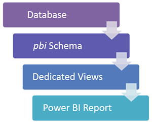
If getting data from a relational source such as SQL Server, use views to abstract the report from the physical layout of database tables and never write queries inside reports; from a maintenance and development standpoint, it is simpler and faster to update a view than it is to edit a query inside a report and then republish the report.

Also, if available, create a separate schema for the views for grouping and security purposes.  This is the recommended architecture:

Click here for a full set of Power BI best practices.

Please follow and like us:

Carefully Choose the Data Source Connection Method in Power BI

There are three ways to connect to data: Import, Live Connection, and DirectQuery (note: currently in preview are hybrid methods).  The choice of method will depend on various considerations, such as the size of the data, the number of users, and the data refresh needs.  Make sure an appropriate assessment is made before the report is built, as switching from one method to another is not always possible or straightforward.

The following chart summarizes the options on several dimensions.

chart

*This is for Power BI Pro.  Power BI Premium has more flexible refresh and size limits.

Click here for a full set of Power BI best practices.

Please follow and like us:

Setting Up Drillthrough Filters in Power BI

[8 September 2017]  This feature is now part of the September release of Power BI Desktop.

A recent addition in the Power BI Service is the ability to define “Drillthrough Filters” in a report page.  You can think of these as dataset fields that serve as parameters to the report page.  Let’s call such a page a “drillthrough page.”  You can navigate to a drillthrough page from another page by right-clicking on a visual that includes one of the drillthrough fields.

Set Up

For example, I have a report about sales and collections that includes salespeople and their supervisors.  One of the report’s pages, called Totals, breaks down sales and collections by salesperson and allows filtering by month/year and supervisor.

1

I will use this page as a drillthrough page with Supervisor as a drillthrough filter by dragging the Supervisor field on to the new “Drillthrough filters” field well for the report page:

2

Once you complete this action, a new shape visual (an arrow) will be added to top-left corner of the page.  This will serve as a “go back” button when navigating by clicking on it while pressing the Control key:

3

The visual is hard to see in this case but you can move it around and even edit it, just like any other shape visual:

4

And note the new “Back button” option for the visual:

5

In fact, this option is now available for all shape visuals and clicking on it will get you back to the previous page, regardless of drill through.

Drilling Through

If I go to a visual on another page that includes the Supervisor field I’ll get a new option when I right-click on an item:

6


When you drill through, you will see that the Drillthrough filters field well now has the corresponding value selected as a filter.  It can be modified and cleared, too:

8

Finally, a page may have more than one drillthrough filter and a field may be a drillthrough filter for more than one page.  For the latter case, you would get multiple options on right-clicking:

7

Please follow and like us:

Overlaying an Image to get a Proportional Fill Effect in Power BI

In a super cool trick for Power BI, Miguel Myers (@myersmiguel) did an overlay between a bar chart and a duplicated image to simulate a proportional fill, resulting in this:

base example

You can see the full report here.  While he shows how to do it in a YouTube video, it took me a while to simulate it and I thought it would be nice to write it up.

To start, you will need an image to work with.  This is my initial image:

Original Image

Now make the outside of the silhoutte the same color as the background of your report.  In my case, it’s already white so I didn’t have to do anything (in Mykhael’s report, it is black).

Next, make the shape transparent:

One Image Photo

And then duplicate it as many times as the maximum for your measure, as in:

Many Images Photo

For example, for a measure that’s a percentage, you may want to have 10 shapes so that each represents 10%.

Now to the report.  Create a bar chart and remove the X axis and the title:

Clean Chart

Bring in your image over it and immediately you will start seeing the end result:

Iniial Overlay

Adjust the heights of the bar and of the image so that the bar is fully covered:

Adjusting Height

Then left-align the image to the start of the bar

Final View

So that the bar does not stretch past the image, you will need to make sure that the image is exactly and completely filled at the max value of the measure.  This will also take care of displaying the right amount of fill for the different values of the measure.

Another key point is to set the start and end values of the axis so that they don’t change with different filter selections in your report and then wreak havok on the proportions you just coordinated.

This is the final product:

Animation


Please follow and like us:

One Solution to the “missing intermediate data” Error on Power BI Relationships

One of the great new features in the September 2015 release of the Power BI Desktop is calculated tables.  I recently used it to create a table of pharmaceutical product groups, because the group names where present in the Product table but not in a column with unique values; therefore, I could not use the column on the one-side of a 1-many relationship.  I created the table Product Group with this formula:

Product Group =
DISTINCT(VALUES('Product'[Group]))

I then tried to create a relationship between the resulting column, which I renamed “Group”, and the column “Brand” on the Speaker Event table:

Try Create Relationship

But this is what I got:

Error Message

“Missing intermediate data”?  After a while, I discovered that at the very end of the Group column there was a blank value.  Removing it resolved the error.  I did this by changing the calculated table’s formula to this:

Product Group = FILTER(DISTINCT(VALUES('Products'[Group])),'Products'[Group] <> BLANK())


Please follow and like us:

Resolving Unexpected Behaviors with Latitudes and Longitudes in Power View and the Power BI Desktop

A couple of months back I wanted to do a simple map showing the location of health centers in Puerto Rico based on latitudes and longitudes, using Power View and PowerPivot.  However, Power View insisted that all of the locations where off the west coast of Africa!  After battling back and forth for a while and triple-checking the values directly in Bing Maps and in Google Maps, I discovered that the data types of the latitude and longitude fields had to be Decimal Number.  Look at the before and after results:

Comparison

I would have quickly discovered the need for the Decimal Number data type if I had tried to categorize the fields as Latitude and Longitude (respectively) in PowerPivot, as it gives this warning:

Category and Data Type Warning

The categorization didn’t initiallly occur to me as I was telling the map chart exactly what fields to use for Latitude and Longitude; I thought that was enough indication.

Chart Spec

The Situation in the Power BI Desktop

In the Power BI Desktop the data type expectation is immediately obvious because if the fields are text, it will force a COUNT aggregation:

Count of Latitude

This can be noticed as soon as the field is dragged to the box, but we cannot get rid of the COUNT because it lacks the familiar “Do no summarize” option that we have in Power View.  Moreover, categorizing the field (as shown below) does not resolve the issue either:

PBID Latitude as Text and Categorized

Apparently the category is treated as secondary to the data type.  Therefore, one must type latitude and longitude fields as Decimal Number.

Please follow and like us: