“Work smart, not hard” is a powerful aphorism of universal application. In this article, I share what I have learned about increasing productivity in Power BI. I won’t be sharing tips or tricks on speeding up queries or creatively formatting visuals. My focus is to share high-level lessons with intermediate and advanced Power BI professionals on how to achieve consistent productivity gains in Power BI projects.
1. Continuous Learning
Sharpen the Axe: Invest time in broadening and deepening your skills.
Recognize that being highly effective in Power BI will require complementary skills such as SQL, database design, and data visualization. Moreover, since Power BI is constantly evolving, staying up-to-date with releases is essential.
This list will necessarily be incomplete but here are my main educational recommendations:
Books:
- Ultimate Guide to DAX (Russo, Ferrari): Deepen your understanding of DAX.
- The Definitive Guide to Data Modeling for Power BI (Russo, Ferrari): Learn the art of building optimized, scalable, and manageable data models.
- Storytelling with Data (Nussbaumer): This book builds upon the classic data visualization books by Few and Tufte.
- The Data Warehouse Toolkit (Kimball, Ross): The classic book on data warehouse design and star schemas.
- Star Schema, The Complete Reference (Adamson): More design guidelines and principles directly applicable to Power BI.
Online Learning Resources:
- SQLBI.com: Advanced articles, courses, and tools for mastering DAX and data modeling.
- Guy in a Cube: YouTube videos, tutorials, and live Q&A sessions focusing on practical tips and new features.
With skills sharp, let’s get into how to approach the work itself.
2. Understand Requirements
Gather comprehensive requirements to avoid rework.
Be sure that you understand the overall purpose of the report, its intended ROI, and how it fits into existing business processes. Also, gather up-front key technical information to inform your report’s architecture, such as intended audience(s), row-level security needs, and data export expectations. (Yes, we Power BI people dread the “How do I export the report to Excel?” question, and we try to push back and automate as much analytics as possible in reports, but oftentimes users need raw data for ad hoc analyses using tools they are proficient in.)
Finally, adopt agile development methods to iterate and refine. This approach reduces rework and, through feedback loops, ensures the final product aligns with user needs.
With requirements in hand, let’s consult a creative partner.
3. Use ChatGPT
Use your favorite LLM to generate ideas for metrics, report design, data model structures, and ways to visualize data.
An LLM can assist with all of these tasks, including coding in DAX and M. A real example speaks for itself. I do this for most reports, especially ones in areas I am not too familiar with.
Prompt:
Reply (abridged for brevity):
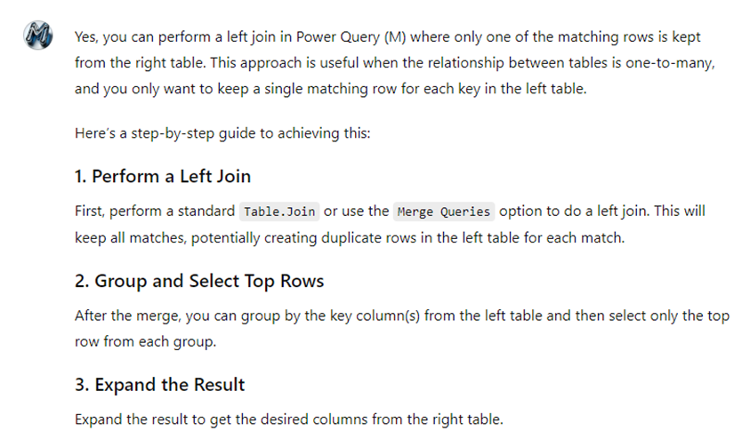
We know that LLMs are particularly competent for coding tasks. Use them to help with M and DAX. Another real example:
Prompt:

Reply (abridged):
With enriched requirements, let’s start building.
4. Master M Functions
Improve your efficiency with data transformations by packaging code in functions.
Here are a couple of common examples:
- Change data types en mass; e.g., from decimal to fixed decimal. Unfortunately, the latter is the default for decimal numbers, but it’s more expensive and less appropriate for most business reporting.
- Format and clean column names to maintain consistency and save time. This is especially useful when the back-end system gives you column names such as CUSTOMER_NAME. A function can loop through all column names and rename them with simple transformations. Example result: Customer Name.
5. Build a Personal DAX Library
Save commonly used DAX expressions and patterns to speed up development.
Have a template report, or reports, with patterns that commonly repeat, such as time intelligence measures, and with code that was hard to develop, and you think will be useful to keep handy for the future.
One saved pattern that I keep going back to, maybe because of my sometimes-faulty memory, is how to calculate the category of a column in a fact table by looking up range values in a dimension table. For example, the fact table has a column called Number of Days Elapsed and I want to create another column that tells whether that value is between 0 and 5, 6 and 10, and so on. That sounds easy enough, but I often had to search online to figure out how to set up a relationship between the tables without causing a circularity error. (Hint: you need to use ALLNOBLANKROW() in the calculated column.)
Great formal resource for code templates: DAXPatterns.com.
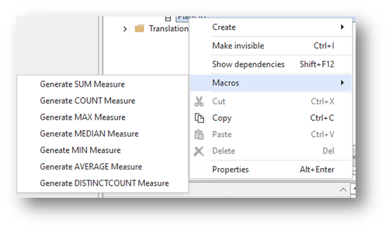
6. Leverage Tabular Editor Macros
Create macros to automatically generate common measures.
Examples:
- Remove default summarizations across all tables.
- Set all date columns to short date, self-adjusting format.
- Generate standard measures like COUNTROWS, MAX, MIN, etc.
Example macros for tables:
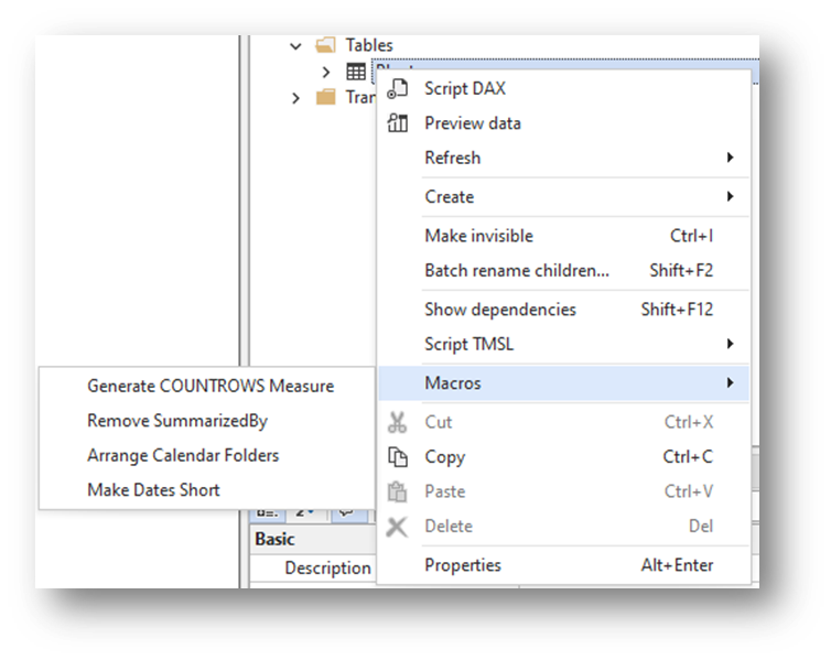
Examples macros for columns:
Additional uses for Tabular Editor include advanced debugging, performing dependency checks, and running the Best Practices Analyzer.
7. Utilize Report Themes and Templates
Start efficiently by using themes and templates.
Report Themes: Standardize colors, fonts, and visual styles to maintain consistency across reports.
Report Templates: Pre-configure headers, footers, logos, and standard tables like calendars to speed up report creation. Include common M functions too, as described above.
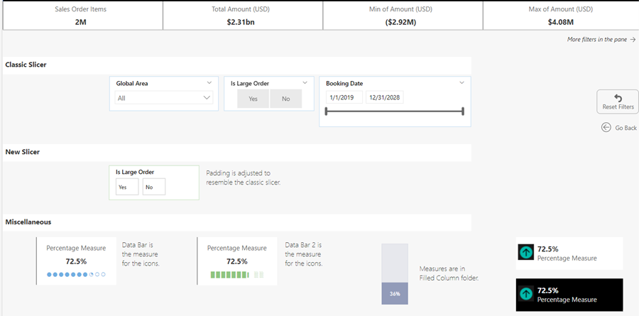
8. Maintain a Visuals Library
Create a repository of pre-configured visuals and graphical items to reuse across reports.
If you find yourself always configuring a filter visual in a certain way, for example, to suit your style, save a copy to your library. Common tailorings I apply to visuals include heights, widths, titles, paddings, and fonts. Others, like the Miscellaneous ones below, involve supplementary measures to achieve their look.
Here’s a glimpse my library:
9. Architect with Dataflows
Use dataflows to centralize data ingestion, cleaning, and pre-processing, ensuring data quality, consistency, and smooth reusability.
Common examples include any kind of “master” data, such as customers and products, but also calendar tables, exchange rates tables, and code-and-description tables like medical procedure codes and sales order status codes.
10. Avoid Technical Debt
Do it right the first time: Invest in quality design and development upfront to avoid costly fixes and redesigns later.
As your knowledge of best practices increases you will instinctively notice when you are cutting corners. Most deviations from best practices will become noticeable later and will require rework. Fixing your work later is far more costly than doing it right the first time.
Some common examples of places where corners are cut include:
- Data modelling: not using star schemas or not being strategic about many-to-many and bi-directional relationships.
- Naming conventions: cryptic column names that are hard to decipher or that require renaming in every visual.
- Code: poorly formatted DAX or M that is hard to follow.
- Not paying attention to query folding.
11. The Ultimate Hack: Cultivate Pride in Your Work
Strive to ensure that every Power BI artifact you create is thoughtfully structured, thoroughly documented, and fully optimized. By consistently applying best practices and leveraging the right tools, you foster a sense of craftsmanship and pride in your work. This commitment to quality not only enhances productivity but also builds a cycle of continuous improvement and self-motivation.